Map Labels
When working with shape maps, the Data Labels feature will be exposed in Component ribbon. By default, it is enabled to show values in the map; you can opt to show percentages and/ or captions, or disable data labels. You can also change the formatting for value labels, and customize label font. These functions help you to customize the look and feel of the map, by controlling what kind of labels appear, and how they look.
How to Apply Data Labels
Data labels are enabled by default. You can show or hide data labels by toggling the button from the Component ribbon.
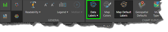
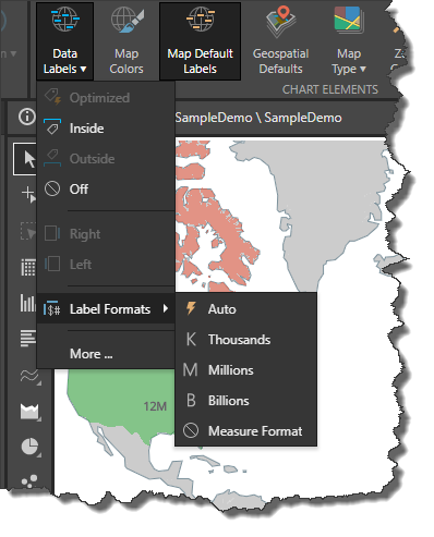
Open the Data Labels drop down for more options:
Off: turn off labels
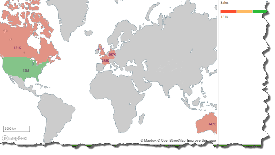
Label Formats: choose from automatic formatting, thousands, millions, billions, or the format of the measure in the data source.
More: click More to open the Data Labels dialog, where you can customize labels.
Data Labels Dialog
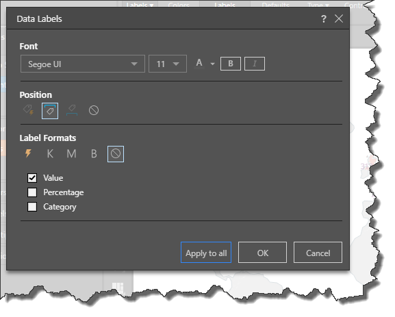
Font: change the font type, size, color, and emphasis.
Position: when working with data labels in other chart types, you can reposition the labels. When working with shape maps, they are set to be positioned inside their respective shape.
Label Formats: choose from automatic formatting, thousands, millions, billions, or the format of the measure in the data source.
Value: show the measure value for each shape.
Percentage: for each shape, show the percentage of the total. For instance, if the measure is sales, display the percentage of total sales that each shape accounted for.
Category: show the element caption for each shape.
Example
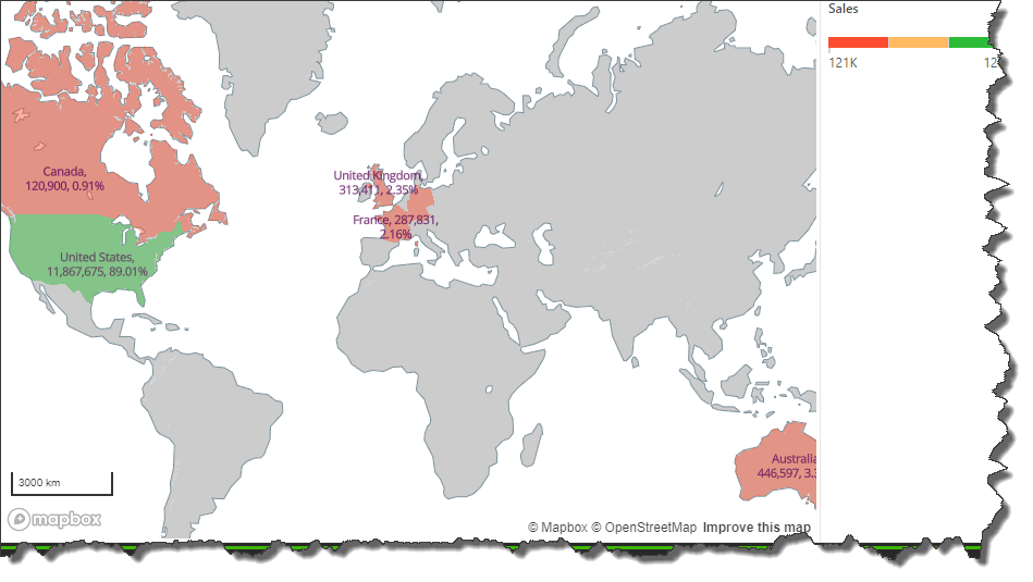
In this example, labels were enabled to show value, percentage, and category. We can see that the United States made over $11, 000,000 in sales, accounting for 89% of total sales.